“Discover the hidden gems concealed in ordinary situations. Explore the fascinating secrets that are hiding in plain sight.”
Symbols and messages abound in the world. Although they may not always be visible, they are always present when we are exploring, going on errands, going shopping, or using the internet.
All you have to do is know where to search. You’ll see the world in a new light once you realise these small secrets hiding in plain sight, from large brand logos you encounter every day to surprising sights that’ll make you gasp.
Baskin-Robbins:
The Baskin-Robbins logo is visually appealing, possessing a snappy appearance with colours and letters reminiscent of a child’s fine art assignment. It will surprise you to learn that there’s more to it than that. If you examine carefully, you will notice that the pink highlights the figure 31 rather than merely adding extra colour to the design.
The (31) stands for the quantity of unique flavours the ice cream company introduced in 1948. It was the first ice cream parlour to offer samples prior to purchases. Baskin-Robbins continues to honour the original 31 to this day.
Amazon:
After you glance at the logo, this corporation wants you to know that you can find anything on Amazon.com. It is no accident that a straightforward and impactful logo featuring an arrow pointing from A to Z exists.
The initial logo of Amazon, which Jeff Bezos used when he founded the firm in 1994. Was far less imaginative than this one. The design changed as the company’s offerings grew beyond books. They did not begin to use this one until the year 2000.
FedEx:
The FedEx logo, which capitalises the negative space between the letters “E” and “x” to create an arrow that shoots forward or right, is the epitome of simple yet clever design. The courier service provider is a well-known brand worldwide.
Any courier service provider would want to convey to its clients that the arrow stands for precision and quickness. The company was established in 1971, but this symbolic logo wasn’t made until 1996.
Hershey’s Kisses:
Your best bet is to examine the negative space in any logo if you’re searching for a hidden message. You might be too preoccupied with devouring the cookies to notice, but the Hershey’s Kisses logo attests to that.

The “K” and the “I” of their Hershey’s Kisses cookie emblem come together to resemble a chocolate kiss, with negative space between them. Even though this logo is new, it mimics the design of a Hershey kiss, which hasn’t altered since 1907.
Delta Air Lines:
The logo of Delta Air Lines is a clever design that incorporates the symbol of the fourth letter in the Greek alphabet, Delta. The logo’s white lines also symbolise an aeroplane’s wings—specifically, the DC-8, Delta’s first jet aircraft.
Delta’s emblem also alludes to the airline’s Mississippi Delta origins.
Toyota:
The Toyota logo will demonstrate to you that auto logos can also have hidden connotations. Official sources state that the white space in the background represents “Toyota’s technical growth and infinite potential ahead,” while the three ellipses on the logo stand for “the unity of the heart of our consumers and the heart of Toyota goods.”
BMW:
Regarding the true meaning of the blue and white in the BMW emblem, there are two schools of thought. The company started out as an engine maker following the first World War, therefore the lingering idea is that it represents a propeller.
Not everyone shares this viewpoint; some believe that the blue and white pays homage to the Bavarian flag, which is where the company originated. Whatever the case, the two arguments seem to have some merit and provide the consumer with food for thought.
LG:
At first glance, LG Electronics’ logo seems like a winking emoji face. Upon closer inspection, you will see that L stands for the nose and G for the face’s shape.
Some fans claim that LG’s logo looks like a modified Pacman.
Goodwill:
Most individuals who have donated or purchased used goods are familiar with the smiling half-face on the Goodwill logo, but not everyone is aware of its symbolic meaning.
The Goodwill logo’s happy half-face, which appears as the letter “G” but has a different backdrop colour. One innovative technique to demonstrate that the message is not always in the image is to hide the logo amid the text.
Gillette:
Consider the razor’s edge—the Gillette logo embodies this.
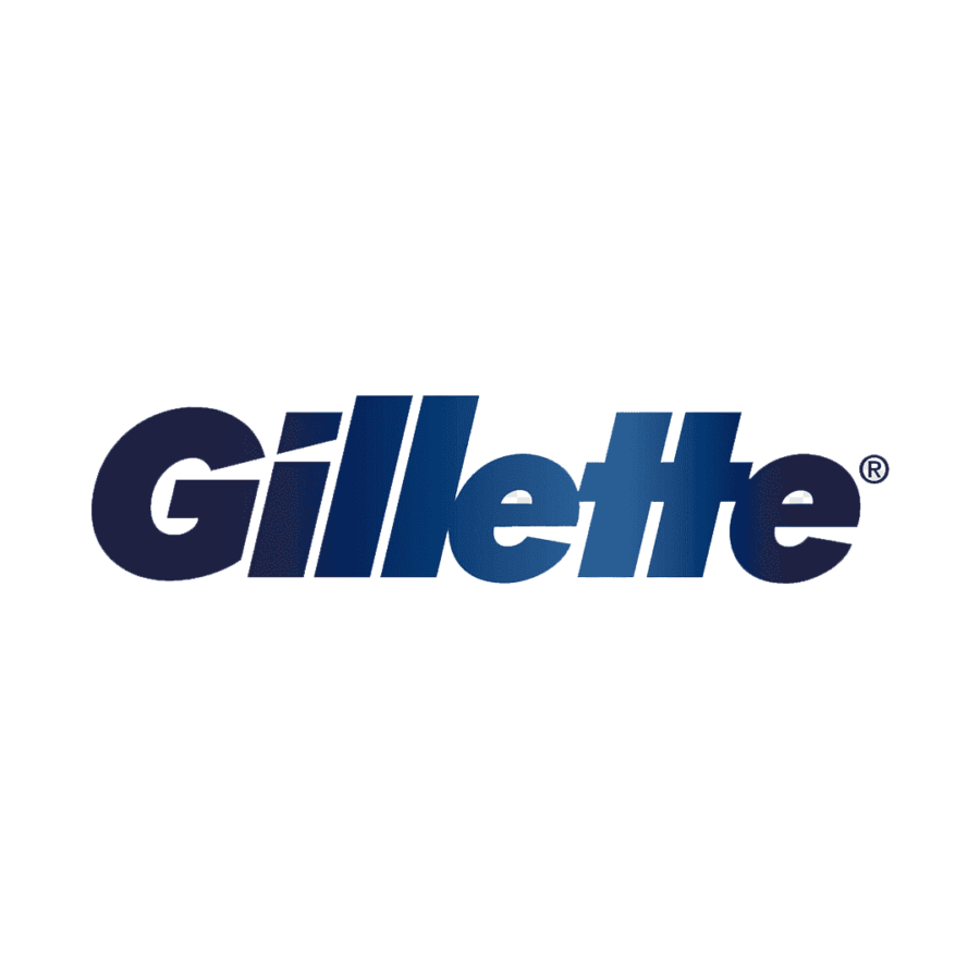
The logo alludes to the razor in a subtle yet effective way, with the negative space in the letters “G” and “I” evoking the shape of razors.
Cinderella Castle:
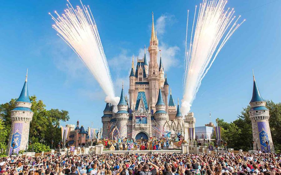
Unbeknownst to most, the Disney World Cinderella Castle contains hidden chambers where guests can stay as a reward for winning a particular amount of money or as a prize for any other reason.
Tunnels In Vegas:
The nightlife, casinos, strip clubs, and fantastic hotels of Las Vegas are well-known. Beyond that, behind its enormous network of tunnels, it also supports an underground life. There are hundreds of individuals living in these tunnels.
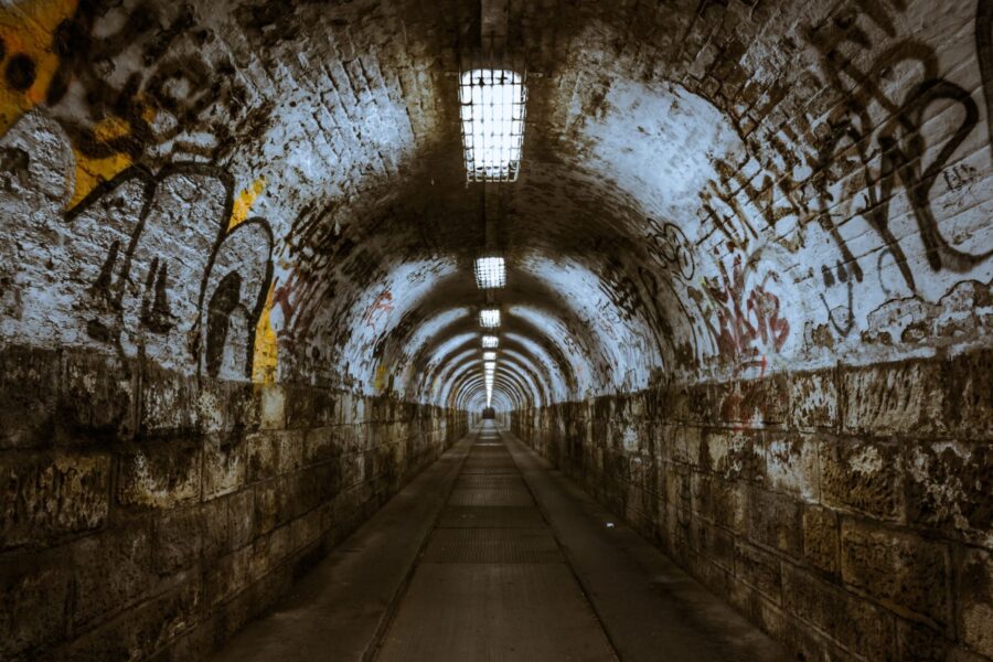
If you turn on your torch and discover that a whole neighbourhood of homeless people is staring at you, don’t be shocked.
The Giant Celtic Cross:
Liam Emmery built this 328-foot-long Celtic cross in the Republic of Ireland, close to the United Kingdom border, six years prior to his passing.

The amount of work and effort that must have gone into creating this enormous cross that is visible from the heavens is only surmountable.
For more interesting blogs, visit: Wellnesio.com and blog page

